Chromatic 2.0 beta
Publish Storybook online to gather feedback faster
TLDR: Chromatic 2.0 beta is now available! Automatically publish your Storybook online to gather feedback from your team, assign stakeholders, test for regressions, and get sign off faster. All integrated into your existing CI/CD pipeline. Made by Storybook maintainers.
Shipping production UIs takes a team. Developers, designers, and product managers must work together to create compelling experiences. But balancing feedback from teammates is tough because everyone is different and, well, has opinions.
If you’re a UI developer like me, you can spend more time managing and responding to feedback than actually building features.
Chromatic 2.0 (now in beta) tames the chaotic UI review process. You automatically publish your Storybook online and Chromatic provides streamlined workflows for gathering, tracking, and approving feedback. This helps your team iterate faster with far less work.
Chromatic visual testing and review are meant to complement each other.
Why visual review?
My favorite quote for shipping user interfaces has nothing to do with UIs.
“Everyone has a plan until they get punched in the mouth.”
— Mike Tyson, boxing heavyweight champion
No UI is perfect the first iteration. The flaws in our plans, specs, and designs can only be revealed when put into practice.
Every day, developers fill out missing design details to get the final sign off. You paste screenshots into Slack, GitHub comments, Asana, and email. Stakeholders then bombard you with feedback. And repeat until you’re done.
It’s chaos. Tracking feedback through iterations takes an astounding amount of effort. At Chromatic, we automated key workflows for gathering feedback, iterating on implementation, and getting stakeholder sign off.

How it works
Chromatic 2.0 introduces a new workflow called visual review. It’s like code review, but for user interfaces. Use visual review together with code review to refine UI implementation and confirm look & feel with your team.
Note: Visual review and visual test are built to be used together. Similar to how you’d use code review and unit tests together.
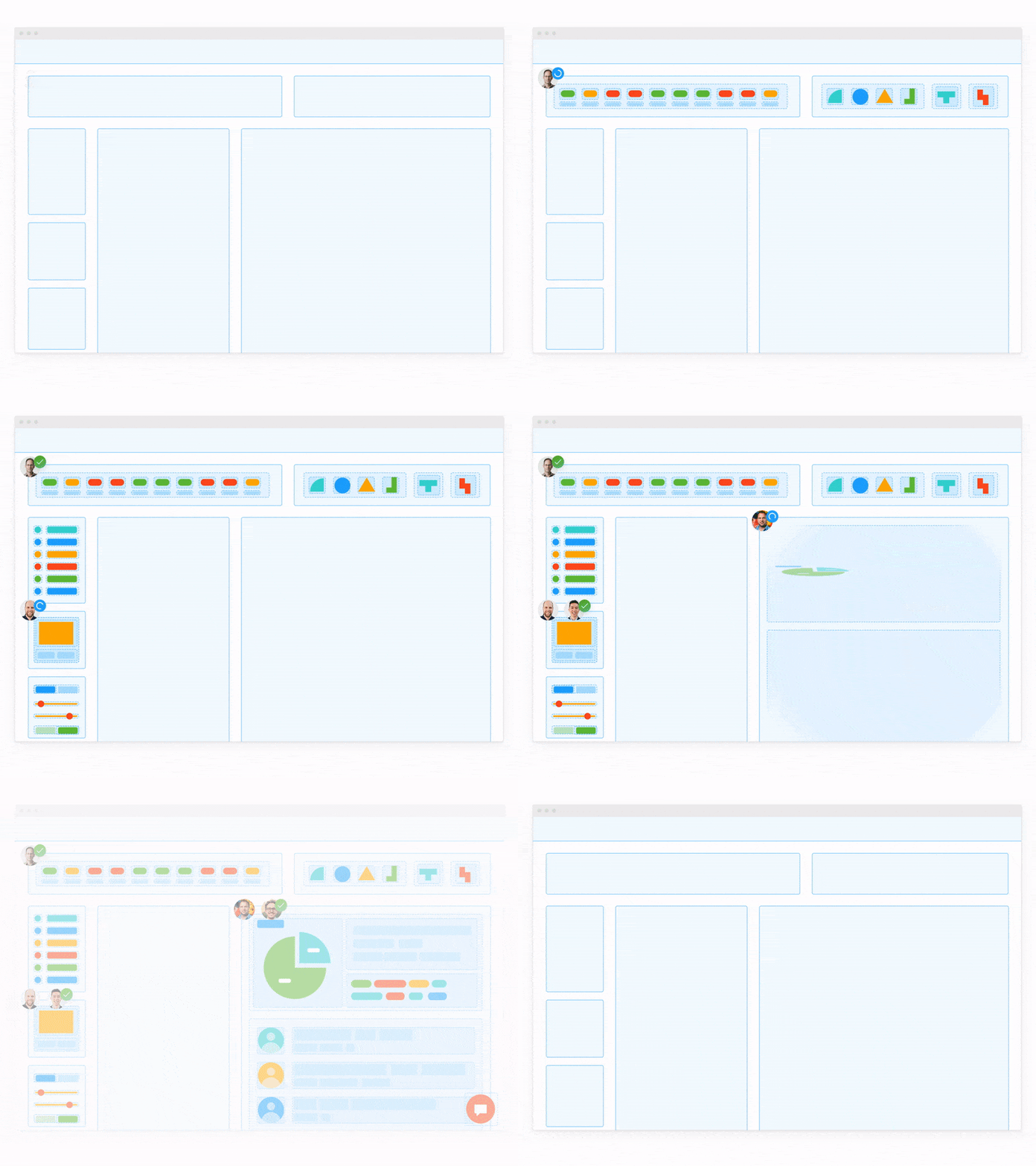
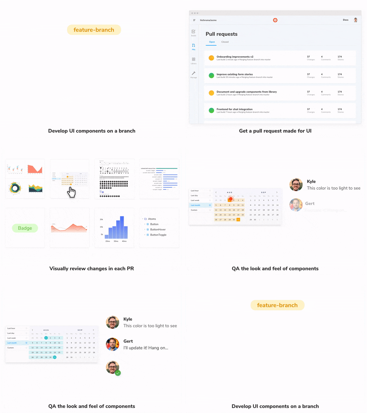
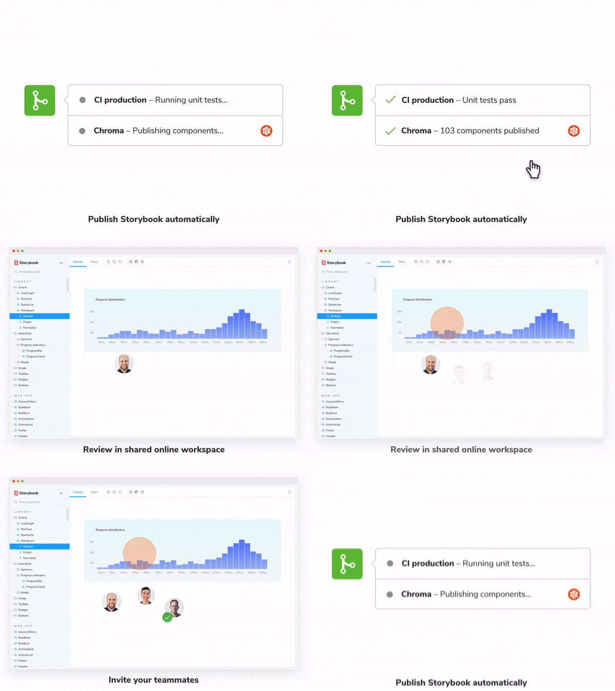
1. Chromatic publishes your Storybook online whenever you push code. It connects to your CI/CD pipeline to document, version, and index all of your components in the cloud.
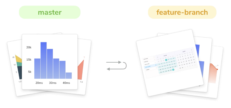
2. Every time you create a pull request, Chromatic scans for new or updated UI. It compares components from your feature branch to the target branch to visualize the impact of incoming UI updates.
3. Chromatic detects UI changes in PRs automatically. Stakeholders navigate to our webapp to review the implementation. Chromatic saves them time by focusing their attention on only the UI that changed.
Say bye to git checkout, messing with node_modules, or sending screenshots back and forth.
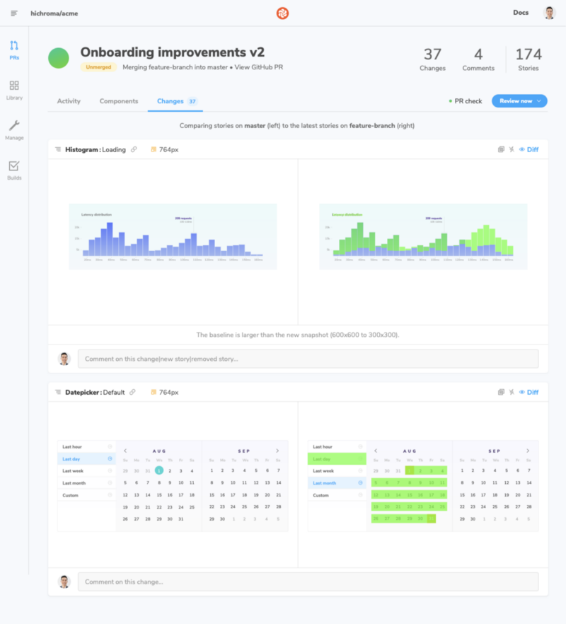
4. Start a discussion with fellow developers, designers, and PMs to request changes and ask questions. Discussions live alongside the interactive UI so you don’t have to tab back and forth between the live implementation and collaboration tools.
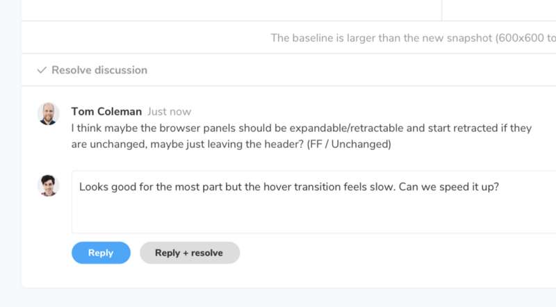
Every discussion is consolidated in the PR activity feed. This helps everyone keep track of progress and gives you a paper trail of past decisions. In addition, participants are notified of new comments via email.
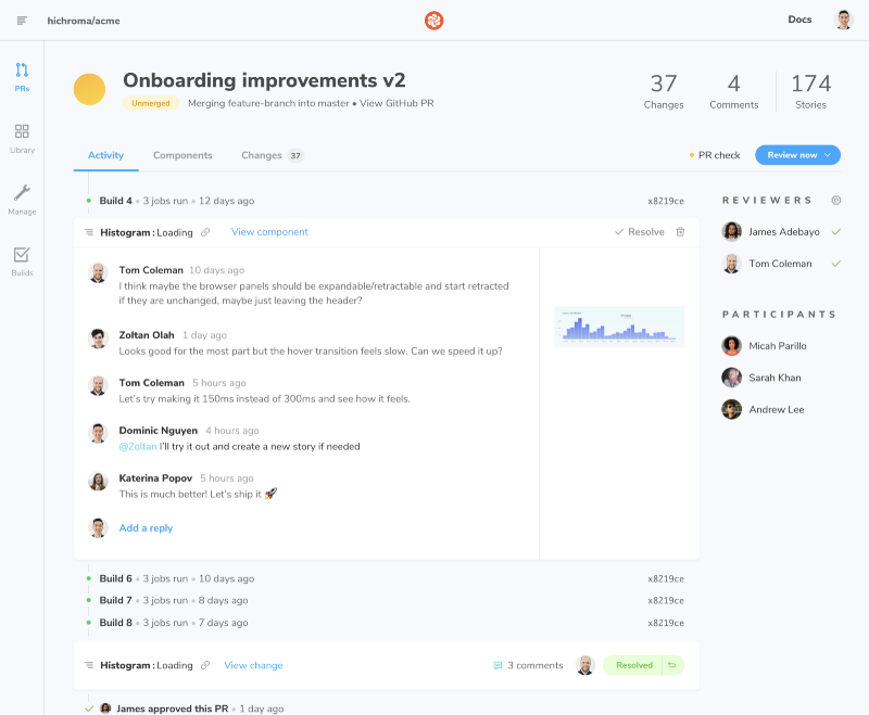
5. Request feedback by assigning teammates in the sidebar. That will ensure the PR check remains 🌕 “Pending” until the PR has been reviewed.
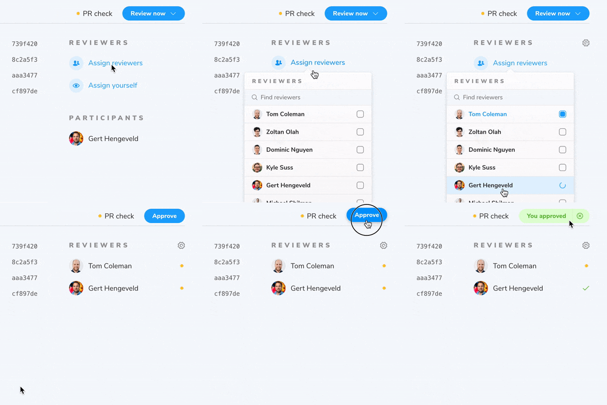
Each PR includes a UI checklist that guides your team through the Chromatic review process. You’ll get an overview of merge blockers like pending reviewers, unresolved discussions, and JS errors to stay abreast of remaining todos.
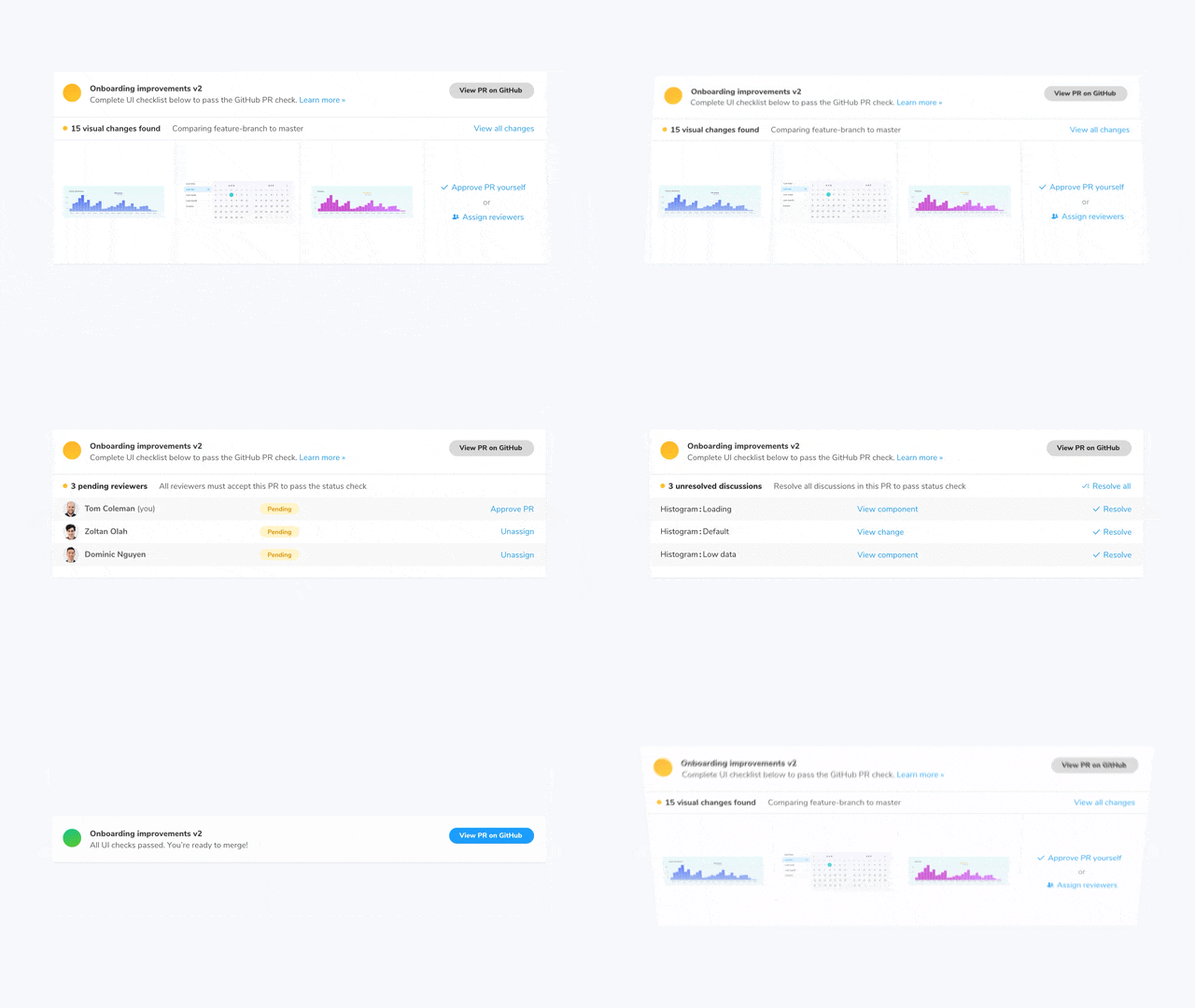
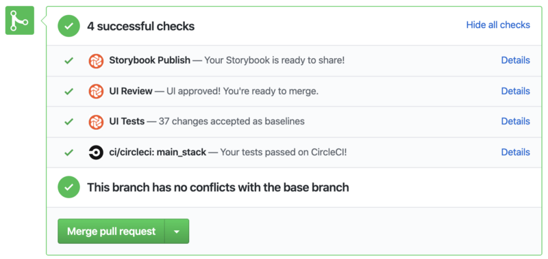
6. When finished, Chromatic will update the PR check in GitHub, Bitbucket, or GitLab. This helps the rest of your engineering team track UI implementation progress in a glance.
Q: Who else uses this workflow?
The visual review workflow is based on our experience as Storybook maintainers, research with leading teams, and invaluable guidance from early access users at Shopify, Algolia, and many more (thank you!).
Q: Alright, so what’s it going to cost?
Nothing. Visual review reuses the same snapshots you already take for your visual tests. That means your team gets a timesaving workflow at no extra charge.
What’s more, Chromatic gives you unlimited collaborators. You’re safe to share work with teammates without worrying about price increases with additional collaborators.
Q: What’s the difference between visual review and test?
Visual review helps developers loop in stakeholders to gather feedback and merge faster. Visual test is for developers doing regression testing, similar to how you’d use unit tests.
Review and test are purpose-built to solve different challenges. I recommend using both workflows together to save the most time.
Migration instructions 1.0 → 2.0 beta
Update package to storybook-chromatic@^3.5.2
Before we begin, let’s update storybook-chromatic@^3.5.2 to benefit from a host of bug fixes and stability improvements.
Unlock pull requests
Unlock visual review in pull requests by navigating to the pull requests screen and follow the instructions to install Chromatic’s GitHub app or GitLab/Bitbucket webhooks.
Chromatic PRs help you refine UI implementation with stakeholders. Similar to code pull requests, you’ll see visual diffs between branches that you can comment on.
Detailed PR badges
With Chromatic 2.0, you get separate PR checks for Publish, Review, and Test. That allows for finer-grained control over how CI jobs are orchestrated and which are required.
- 📕 Publish: Deploy Storybook to a secure online workspace for teams
- 👨👩👧👦 UI Review: Get approvals and feedback from stakeholders
- ✅ UI Tests: Checks for UI bugs across browsers and viewports
If you have required checks turned on for Chromatic in GitHub, Bitbucket, or GitLab, the updated PR checks may cause your PRs to fail.
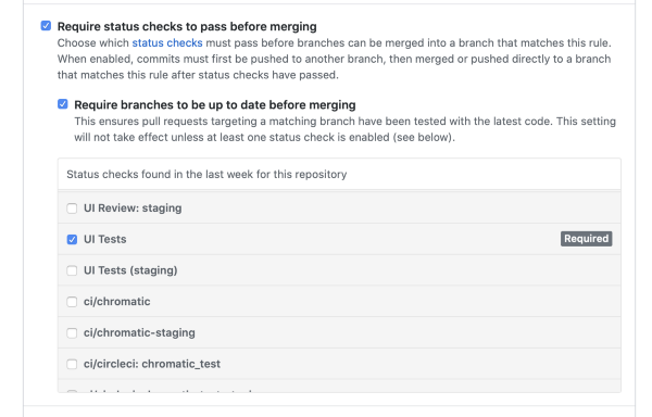
Resolve the issue by switching the required check from ci/chromatic to UI Tests in your repository's "Branch protection rules" page. In GitHub you can find it at this path Settings > Branches > Branch protection rules > “Require status checks to pass before merging".
Once you update the required check to UI Tests, make another commit to clear out the old status.

Chinese, Japanese, and Korean language support
One last thing, Chromatic 2.0 increases your test coverage beyond the Latin alphabet to Chinese, Japanese, and Korean (CJK) characters. Customers who serve East Asia can now render text natively in our cloud browsers without needing to import web fonts.
What’s next?
Teamwork shouldn’t add more work. Next, we are focusing on making UI review smoother by acting on your feedback.
Get emailed when 2.0 launches
Anyone can add Chromatic 2.0 beta to Storybook for free and start using it immediately. Index and browse components in the cloud by setting up GitHub actions or by connecting to another Git/CI provider. Sign up to get emailed when 2.0 officially launches.